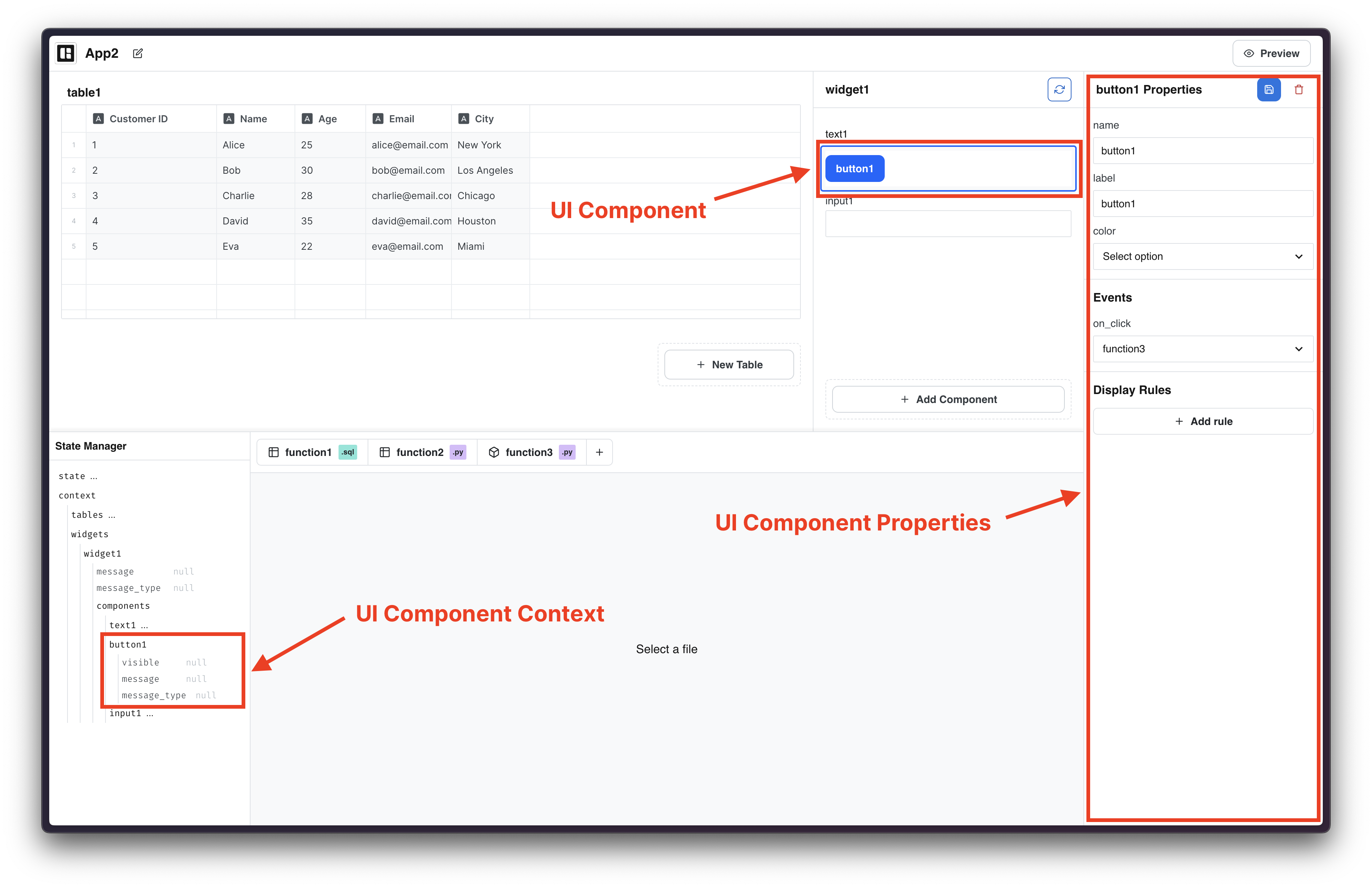
Components
UI Components are form elements that allow users to display text, input data, select options, or trigger Functions. You can access UI Component properties from the property sidebar on the right and you can inspect each UI Component Context from the State Manager.
Text
Text components are used to display text in the widget.
Input
Input components are used to collect user input using a input field. Input fields can be of different types, and depending on the type, the UI will apply input validations automatically. There are 3 types of input:
- Text input: collect text input from users
- Number input: collect number input from users
- Date input: collect date input from users
Select
Select components are used to collect choices or options from users. You can add multiple options to select components. Each option has a name and a value.
Button
Button components enable users to perform actions. The most common action is to trigger a Function, specifically a Python Script.